Case study
Chartreuse: the product and strategy work
Chartreuse is an off-grid text and location device for groups of friends. It carries messages and locations between phones when there is no cell service. I work on it as Technical Product Manager. This is the order the work ran in, from the competitive research through to a live public site. My work included the research, the positioning, the business model, the requirements document, the user stories, the design rules, and the written standards the whole repo runs on.
Step 1 of 7
Researching the industry and the competition
Before we started building, I wanted to know if there was actually room for Chartreuse in the market. Chartreuse sends messages over LoRa. LoRa is a low-power radio technology. It carries data over long distances with no cell tower involved.
I started with a Porter's Five Forces analysis and mapped the main alternatives someone might choose instead: satellite messengers, Meshtastic devices, and walkie-talkies. I compared how they worked, what they cost, who they were built for, and where they fell short for groups of friends outdoors.
What I found
Satellite messengers solve the connectivity problem, but at a cost. Products like Garmin inReach and ZOLEO require a device purchase plus an ongoing subscription. For a group, that cost multiplies quickly. They also depend on satellite coverage and a clear view of the sky.
Meshtastic proves the technology works, but it's built for hobbyists. There are plenty of inexpensive LoRa devices available, but they typically require users to flash firmware, configure settings, and navigate a community-built ecosystem. That's very different from the simple consumer experience I wanted for Chartreuse.
Walkie-talkies were the closest match to our customer. Rocky Talkie was especially useful because it showed that outdoor groups will pay for a well-designed communication product. But walkie-talkies are centered around voice, while Chartreuse is designed around messaging, location, and the phone experience.
I also looked at goTenna, which had previously built a consumer peer-to-peer communication product. It was important evidence that the idea wasn't new, but also helped me understand why Chartreuse needed a clearer consumer position.
Finding the gap
Once I mapped the market, the opportunity became much clearer.
There were products with long-range communication. There were products without subscriptions. There were products designed for outdoor groups. And there were products that worked without cellular service.
What I couldn't find was one consumer product that brought all of those things together.
That became the position for Chartreuse: an off-grid communication product built for groups, with a consumer-grade experience and no monthly subscription.
The research also shaped product decisions beyond positioning. It influenced our pack-based pricing, direct-to-consumer launch strategy, and the decision to prioritize speed because an existing LoRa manufacturer could eventually move into the same space.
Instead of starting with a product idea and looking for reasons to justify it, I used the research to decide what was actually worth building.
Step 2 of 7
Working out the positioning
With the competitive research done, I needed to define where Chartreuse fit in the market, who we were building for, and what we weren't going to build.
The positioning became simple: Chartreuse is an off-grid communication device built for groups of friends.
Setting the product boundaries
I wrote a positioning document that defined what was in and out of scope. I also created one question I could use when evaluating new ideas:
Does a hiking group of four friends need this?
That became a simple way to keep the product focused. If a feature didn't clearly help that group communicate off-grid, it either waited or didn't belong in the product.
It also helped shape our core personas: the Organizer, Crew Member, Worried Family Member, and Newcomer.
Turning the research into product decisions
I used a SWOT and TOWS analysis to turn what I learned from the market into decisions we could actually use.
A few of those decisions became important parts of the product strategy:
- Sell Chartreuse in 2- and 4-packs instead of individual units.
- Focus the experience on the app rather than the radio technology behind it.
- Market around real outdoor scenarios instead of technical terms like LoRa.
- Stay focused on consumers rather than fleet or enterprise use cases.
- Position Chartreuse around group communication instead of as a cheaper alternative to a satellite messenger.
These weren't just marketing decisions. They gave me a clearer filter for product, design, pricing, and future feature requests.
Choosing our first customer
The technology could work for a lot of different groups, from festivals to ranches to ski groups. Trying to build for all of them at once would make the first version too broad.
I chose hiking and backpacking groups of 3–6 friends as our first customer.
That gave me a much clearer context for product decisions. Instead of asking whether a feature could be useful someday, I could ask whether it made the first experience better for the group we were actually launching with.
Other markets weren't ruled out. I documented them for later and defined what would need to be true before we expanded into them, including validating the first market, shipping a certified product, sizing the new opportunity, and understanding any changes the product would require.
Where the positioning landed
By the end of this step, Chartreuse had a much narrower position:
A simple way for a group of friends to text and see each other's location when cell service disappears.
That positioning gave the rest of the product a boundary. It influenced what I prioritized, what I designed, how we planned to sell it, and just as importantly, what I decided not to build.
Step 3 of 7
Finding the business model
Once I knew who we were building for, I worked through how Chartreuse could actually make money.
I focused on three questions: How should we make money? How should we sell the product? And how big is the opportunity?
Choosing the revenue model
I decided to build the business around a one-time hardware purchase with no required subscription, activation fee, or messaging fee.
That decision came directly from the product and competitive research. Satellite messengers usually require an ongoing subscription, but Chartreuse doesn't rely on a satellite network, cellular carrier, or cloud service to work.
Without that recurring infrastructure cost, I didn't see a reason to create a recurring fee just because competitors had one.
Pricing for groups
Chartreuse only becomes useful when more than one person has a device, so selling primarily as individual units didn't make much sense.
I designed the pricing around 1-, 2-, and 4-packs, with the 4-pack positioned as the natural choice for a group of friends.
This also changed how I thought about the buyer. The person paying for Chartreuse isn't always the person using every device. One person might buy a set for their hiking group, give devices to friends, or purchase them as gifts.
That made group purchasing an important part of the business model rather than just a packaging decision.
Planning the buying experience
I mapped the customer journey to see where the product experience needed to extend beyond the app itself.
Two gaps stood out: buying multiple devices needed to feel intentional, and getting an entire group started needed to be simple.
That led to ideas around bundle pricing, gift-friendly packaging, and a quick-start experience that could move a group from opening the box to downloading the app and getting connected.
Going direct to consumer first
For launch, I chose to sell directly through our own site.
Going direct gives us more control over the brand, customer experience, and margin while we're still learning what resonates with early customers.
Retailers like REI, Backcountry, and Scheels make more sense later, once we can show that people are already buying and using the product.
The initial plan is intentionally small: start with real hiking groups and outdoor networks, learn from how they use it, and grow through word of mouth before expanding distribution.
Sizing the opportunity
I built the market size from the bottom up instead of starting with a large outdoor-industry number.
I started with U.S. hikers and narrowed the market based on the behavior that actually matters for Chartreuse: people who backpack, spend time outside reliable cell coverage, and travel in groups.
That brought the base case to roughly 1.4 million potential groups and 5.5 million devices.
I also built low, base, and high scenarios and cross-checked the results against broader category data rather than relying on a single estimate.
Testing the subscription question
Even though I had chosen a no-subscription model, I still modeled an optional subscription to see whether I was leaving a meaningful revenue opportunity behind.
I tested different adoption rates across the same sales scenarios.
The result reinforced the original decision: hardware pricing had a much bigger effect on the business than subscription revenue.
That kept the model focused on selling a product people want to own rather than creating recurring fees around a product that doesn't need them.
Where the model landed
The business model became fairly simple: sell Chartreuse directly to consumers, package it around groups, make money primarily from hardware, and use retail as a later growth channel.
More importantly, the model matched the product itself. Chartreuse was being designed as something a group could buy once, bring outside, and use without depending on another service.
Step 4 of 7
How I ran the work
Chartreuse has a lot of moving pieces across product, design, iOS, and the marketing site. I needed a way to keep the work organized without losing the reasoning behind each decision.
Instead of managing everything across separate tools, I kept the roadmap, product requirements, user stories, plans, and decision records together in the same repository as the product.
The goal was simple: someone should be able to look at a piece of work and understand what we're building, why we're building it, and what needs to be true for it to be done.
From idea to implementation
I created a simple process for moving work from an idea into something ready to build.
An idea starts on the roadmap. If we decide to move forward with it, I write a plan, review it for gaps and dependencies, and break it into smaller pieces when needed.
For product work, that usually means:
Product requirement → user story → design → implementation
A user story is a short description of something a person wants to do in the app.
Each stage connects back to the one before it, so a design decision can be traced back to the user need or product requirement that started it.
This became especially useful as the product grew because decisions weren't scattered across messages or dependent on someone remembering why we had made them.
Keeping scope under control
Every feature still has to pass the same question I established during positioning:
Does a hiking group of four friends need this?
That keeps interesting ideas from automatically becoming product requirements.
I also prioritize stories using Must, Should, Could, and Won't so the first version stays focused on the experience we actually need to prove.
Keeping decisions connected
Some decisions affect more than one feature, so I document those separately instead of letting them disappear inside a task.
The reasoning stays attached to the decision, and future work can point back to it instead of reopening the same conversation.
That way the original product strategy stays connected to what eventually gets designed and built.
Using AI without giving up the process
I also built reusable AI workflows around parts of this process, particularly planning and user stories.
Instead of asking AI to decide how the product should work, I use it to check work against standards I've already defined. For example, it can flag a user story with missing acceptance criteria, or a feature that doesn't fit the product scope. Acceptance criteria are the checks that have to pass before a story counts as done.
The rules come first. AI helps me apply them consistently.
The result
The system gives me one connected record of the product as it moves from strategy to implementation.
The roadmap shows what matters. The requirements explain why. The user stories define the behavior. The designs turn that behavior into an experience. And the decision records preserve the choices that affect everything around them.
For a small team building a new product, that structure has helped me move quickly without letting the product become inconsistent as it grows.
Step 5 of 7
Turning the strategy into product requirements
Once the research, positioning, and business model were in place, I turned those decisions into the first PRD for Chartreuse. A PRD is a product requirements document. It says what we're building and why, before anyone starts designing or building.
My goal was to make it detailed enough that design and engineering wouldn't have to fill in the gaps later.
Defining the MVP
I started by reducing the first version to one core experience:
Send a text from your phone to your friend's phone, through two Chartreuse devices, when neither phone has cell service.
That became the baseline for the MVP. MVP means minimum viable product. It is the smallest version of the product that is still worth shipping.
The first version is built specifically for hiking and backpacking groups of 3–6 friends, so every feature had to support that experience.
I used the same scope question throughout the PRD:
Does a hiking group of four friends need this for v1?
If the answer was no, it didn't automatically become part of the product just because it was technically possible.
Deciding what makes the first version
I narrowed the MVP around the things a group actually needs to communicate off-grid: messaging, group communication, location sharing, connectivity between the phone and device, and basic battery behavior.
I also made the cut list explicit.
Mesh networking, voice, images, SOS and rescue services, advanced radio controls, and other markets were intentionally left out of v1.
Each exclusion had a reason. Some would add too much complexity, some didn't fit the first customer, and others would push Chartreuse into a completely different type of product.
Writing those decisions down was just as important as defining what we would build.
Connecting requirements to what was actually possible
Because the app depends on a physical device, I couldn't treat features as if they existed independently from the technology underneath them.
For every major requirement, I checked whether the device already supported what the experience needed. If it didn't, I documented the dependency rather than assuming engineering would figure it out later.
That helped surface constraints early and kept the product requirements grounded in what we could realistically build.
It also created a clear connection between the product experience and the technical work required to support it.
Defining success before building
I didn't want the MVP to be considered successful just because it shipped, so I defined a few measurable targets in the PRD.
For the first version, that included:
- First message sent in under 5 minutes
- Message delivery in under 5 seconds when devices are in range
- At least 90% of users completing setup without help
I also documented the major technical, market, strategic, and regulatory risks alongside the requirements.
For example, FCC certification couldn't be treated as something to deal with after the product was finished. It had to move alongside development because the product can't be sold without it.
From strategy to something buildable
The PRD became the point where everything from the earlier work came together.
The competitive research influenced what made Chartreuse different. The positioning defined who we were building for. The business model shaped how the product would be sold. And the technical constraints determined what the first version could realistically support.
From there, I could move into user stories and design with a much clearer set of boundaries.
Instead of starting with screens and deciding what the product should do along the way, I defined the product first and designed against those decisions.
Step 6 of 7
Turning requirements into user stories
With the PRD finished, I broke the product down into user stories.
I wrote 33 stories across five screens, covering the core experience from onboarding and pairing through crews, messaging, and location.
Making each story design-ready
I wanted the stories to answer the questions I would otherwise run into while designing.
Each one identifies the user and what they're trying to accomplish, along with priority, acceptance criteria, dependencies, and relevant edge cases. An edge case is anything outside the normal path, like a failure or a screen with nothing on it yet.
I also use Given/When/Then when behavior needs to be especially clear. It splits one scenario into three parts: where things start, what happens, and the result.
For example:
Given a message is sending
When the connection to the device drops
Then the message stays queued and retries when the connection returns.
My definition of ready is simple: I should be able to design the screen from the story without having to guess how the product is supposed to behave.
Designing for more than the happy path
One of the biggest parts of this work was thinking through what happens when things don't go perfectly.
I created a reusable list of states to check across the product, including:
- No device connected
- The connection to the device drops during an action
- Low battery
- A friend goes out of range
- No messages, crews, members, or locations yet
- A message is still sending or fails
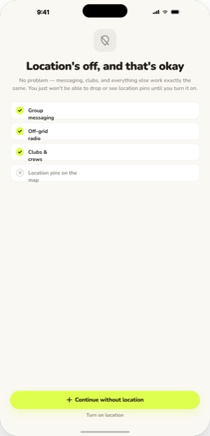
- Pairing fails
Running those scenarios against each screen helped me find requirements I hadn't originally accounted for.
For example, thinking through what happens when the device disconnects while a message is sending led to a new story for queued messages and two additional screen states.
The same process added seven edge states to the pairing flow.
Connecting stories back to the product
Every story connects back to the PRD requirement it supports.
I also track the device capability it depends on and the design that eventually fulfills it. That gives me a clear path from:
Product requirement → user story → design → implementation
That traceability helped uncover gaps too.
Messaging and the map both expected users to have friendly names, but nothing in the product actually gave them one. I caught that while reviewing the stories and added a separate requirement for it rather than letting the designs quietly make that assumption.
Using the journey to find what was missing
I also mapped the experience around a full group trip, from planning and setup through active use and what happens afterward.
That exposed a few places where the individual screens worked, but the overall experience still had gaps.
One of the biggest was location.
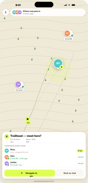
Originally, location appeared as part of messaging. Looking at the full trip made it clear that people would need to see where the rest of their group was without going through a conversation first.
That led me to make Map its own part of the product and write seven stories specifically for it.
The journey also surfaced the need for a group-ready view at the trailhead and better visibility for the person organizing the group during setup.
From requirements to design
By the end of this step, I wasn't starting design with a list of features.
I had a set of stories that described what each person needed to accomplish, how the product should respond, what could go wrong, and what technical capabilities each experience depended on.
That gave me a much stronger starting point for designing the actual app.
Step 7 of 7
Designing the product experience
Once the user stories were ready, I moved into designing the app.
Because I had already worked through the requirements, edge cases, and technical dependencies, I wasn't starting with blank screens. Each design had a clear job to do and specific behavior it needed to support.
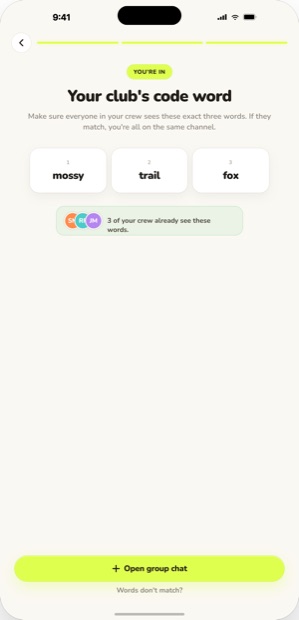
I designed 42 artboards across four core flows, covering the main experience from getting connected to communicating with a group off-grid.
Building the visual foundation
Before designing individual screens, I created the design tokens, design language, and design system for Chartreuse.
I started with the tokens that define the visual foundation of the product. Chartreuse green became the signal color for moments when the device is actively doing something, while a warm cream became the base background.
From there, I created the design language: the rules for how the product should look, communicate, and behave across different states.
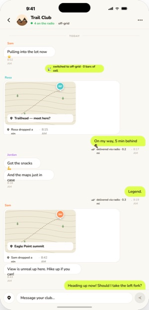
One of the most important decisions was how the app handles going off-grid. Most products treat losing cell service like a warning. I wanted Chartreuse to feel different.
Losing signal should feel like gaining something.
When the app switches to the Chartreuse device, the interface treats that moment positively, and messages clearly show when they were sent over radio.
I then turned those decisions into a reusable design system so colors, components, patterns, and interaction rules stayed consistent as I designed new screens. I carried the same system into the marketing site so the product and brand felt like one experience.
Designing directly from the stories
Every design maps back to the user story it fulfills.
That gave me a direct connection between:
PRD → user story → design
The stories already defined the expected behavior, acceptance criteria, and edge cases, so I could focus on turning those decisions into an experience that felt simple.
It also made it much easier to catch inconsistencies. If I needed a screen that wasn't supported by a story, or a story described behavior that wasn't represented in the designs, I knew something was missing.
Letting the designs improve the product
Designing the flows also surfaced decisions that weren't obvious on paper.
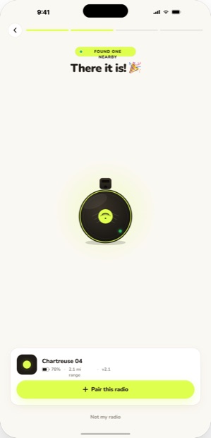
For example, once I worked through onboarding as a complete experience, it became clear that users needed to know where they were in the process.
I added a progress indicator to onboarding and then made it a reusable rule for any multi-step flow rather than solving it only on that screen.
That's how I approached the design system overall: solve the immediate problem, then decide whether it should become a consistent product rule.
Carrying the product into the website
I used the same design system for the public Chartreuse site so the product and brand felt connected.
The site explains what Chartreuse does, shows the app experience, and gives interested customers a way to join the waitlist.
I also standardized the language across the product and site. Terms like Chartreuse device, crew, and delivered via radio have specific meanings and stay consistent wherever someone encounters the product.